Posts in colors
Pantone 2019 Color Trends - Living Coral

Pantone has released their 12 color predictions for 2019. These colors are fun, joyful, uplifting and vibrant with lots of warm colors in reds, oranges, yellows, and pinks. The color of the year is always one of the group. This year the color of the year is:

Living Coral - a soft, warm color that feels like a delicious drink or a welcoming hug. Joyful and vivacious there is a lot of optimism in this hue.


The full palette of 12 colors is warm and playful.

Let’s take a look at the other colors.

Aspen Gold - This color feels like a warm, autumn sun shining down.

Pepper Stem - This color reminds me of a bountiful garden

Fiesta - There is so much excitement and boldness in this color

Jester Red - This deep shade is both elegant and bohemian

Tumeric - Just like the spice, this color adds flavor and intensity

Princess Blue - As the only blue, this color is bold and majestic

Pink Peacock - For those who love intensity, warmth, and lots of fun.

Toffee - Like a perfect piece of chocolate, satisfying and tasty.

Sweet Lilac - This pinky-purple is soft and gentle

Mango Mojito - This golden shade is uplifting and pleasurable.

Terrarium Moss - Inspired by nature and a walk in the wood.
colors, trendsElaine Roberts
Pantone 2018 Colors

Pantone has released their color of the year and the top 12 colors. 

The color of the year is Ultra Violet.  Inspired by the dark, night sky, this color makes us think of limitless possibilities, artistic expression and new creativity.   Purple is both mystical and intriguing. 

2018Pantone.jpg

The top 12 colors from Pantone are fun, fresh, and uplifting.  Most of the colors are bold. 

Meadowlark -  This color is bright and uplifting.   It is perfect for spring. 

Pink Lavender - This calm shade is romantic and warm. 

Arcadia - Fun and vintage,  this cool shade inspires fun. 

Blooming Dahlia - This shade brings to mind soft, summer blooms.

Cherry Tomato - Bold and hot, this color is spicy and energetic. 

Emperador -  Warm and foundational, this color is perfect to add complement.

Little Boy Blue - Bringing to mind clear summer skies, this shade is endless and inspiring

Spring Crocus -  This shade is charming and uplifting

Ultra Violet - The color of the year in magical and distinctive

Almost Mauve -  Soft and delicate, this shade is almost ethereal

Lime Punch -  Bold and vibrant, this color reminds us of summer

Chili Oil - This warm and earthy shade adds balance and depth


colorsElaine Roberts
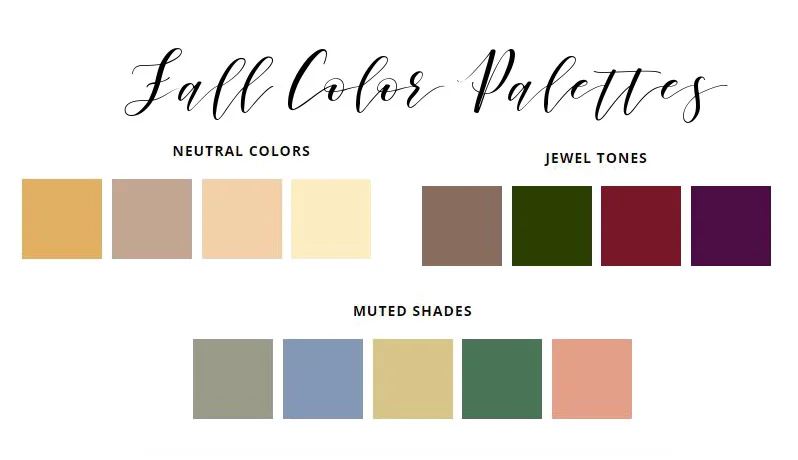
Fall Weddings - Color Schemes
fall color palettes.JPG

When you picture a fall wedding, do you immediately imagine fall leaves and orange pumpkins?  There are so many other beautiful color combinations.  As the weather turns cooler, instead of the orange and red, consider these color palettes. 

Jewel  Tones

Expand the color palette with rich colors like plum, eggplant or navy. Instead of the usual orange pumpkins consider using plums, pomegranates, grapes, or apples.  This color scheme can be paired with darker blacks and grays for a moody fall feel. 

Beautiful Jewel tones for fall wedding (Gina Bilyeau photography, Hannah Elaine photography)

Beautiful Jewel tones for fall wedding (Gina Bilyeau photography, Hannah Elaine photography)

White and Neutrals

While blush has been the popular wedding colors for the last year, fall weddings lend themselves well to neutrals when paired with metallics.  Silver, gold, or copper pair well with white and neutrals for a romantic, elegant look. 

White paired with metals and neutrals makes a beautiful fall wedding palette (Rachel Moore photography, Jennifer Cody photography)

White paired with metals and neutrals makes a beautiful fall wedding palette (Rachel Moore photography, Jennifer Cody photography)

Muted Colors

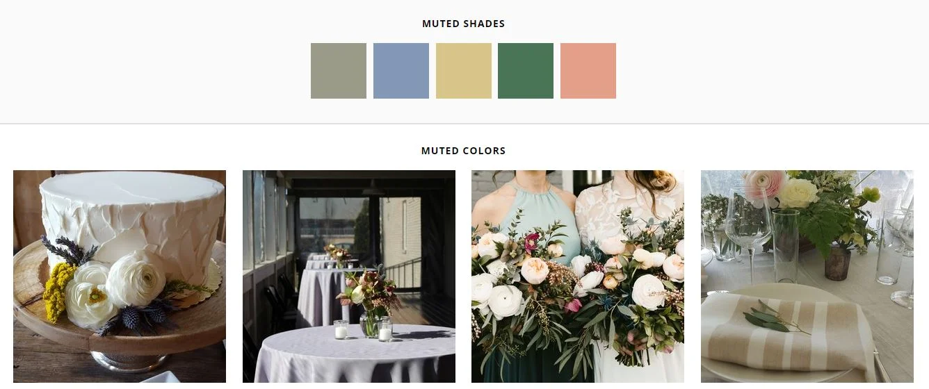
Instead of the brighter nature inspired shades of fall, choose a more muted or muddy tone and subtle shades. Slate, moss, gray, taupe, cream and a pink-brown shade create a modern, unexpected feel.  

Creams, slate, moss, gray, and taupe are muted and soft for your wedding (Gavin Nutt Photography, Madi Flourney Photography, Justin Wright Photography)

Creams, slate, moss, gray, and taupe are muted and soft for your wedding (Gavin Nutt Photography, Madi Flourney Photography, Justin Wright Photography)

colors, inspirationElaine Roberts
6 Color Palettes for a Stunning Wedding
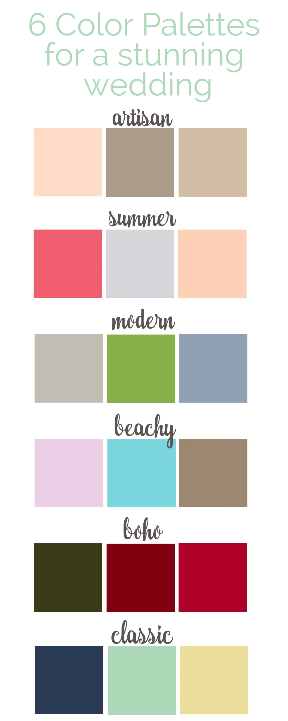
6 Color palettes for a stunning wedding.  Color schemes that fit the style and location of your event. 

A beautiful color palette can make a wedding cohesive, stylish, and memorable.   Here are 6 color combinations to create your vision. 

artisancolorpalette.jpg

Artisan - Karry, Malta, Soft Amber.  This combination creates a soft, relaxed atmosphere with the warmth of the soft pink and the neutral browns.  

summercolorpalette.jpg

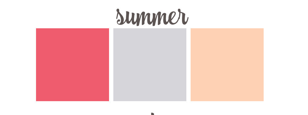
Summer - Watermelon, Fog, Apricot. The heat of summer, ripe fruit and soft skies are elements of this color scheme.  Your guests will love the bright and happy colors. 

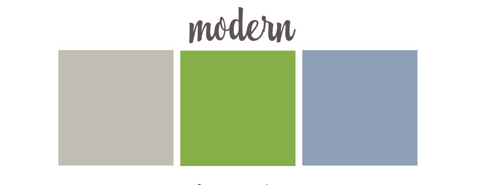
moderncolorpalette.jpg

Modern - Cloud, Greenery, Rock Blue.  Clean and contrasting, this palette feels fresh and modern.  The shades cool undertones make is crisp and organic. 

beachycolorpalette.jpg

Beachy - Thistle, Spray, Sandal.  The sound of waves and the feel of the sand.  Fun and breezy, this palette is casual and relaxed.  

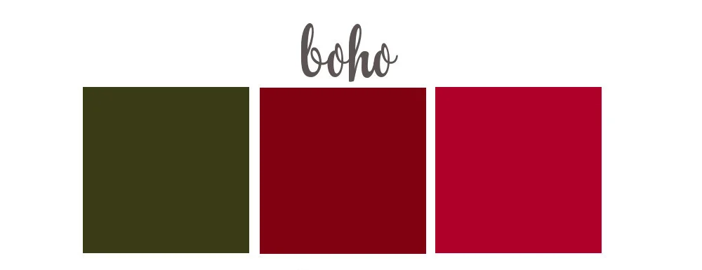
bohocolorpalette.jpg

Boho - Moss, Sangria, Carmine.  For the bride who wants bold and bohemian, this rich color palette is perfect for a free-spirited, woodland gathering. 

timelesscolorpalette.jpg

Classic - Madison, Fringy Flower, Splash.  Traditional and classic, these colors are still charming and inviting.  The dark blue paired with the lighter shade keeps the palette from feeling too formal. 

Six color palettes for a personalized, stunning wedding.   Artisan muted color scheme. Summer bright and fun.  Modern green and blue combination. Beachy aqua and purple style.  Bohemian style with rich colors of reds.  Classic ti…
colorsElaine Roberts
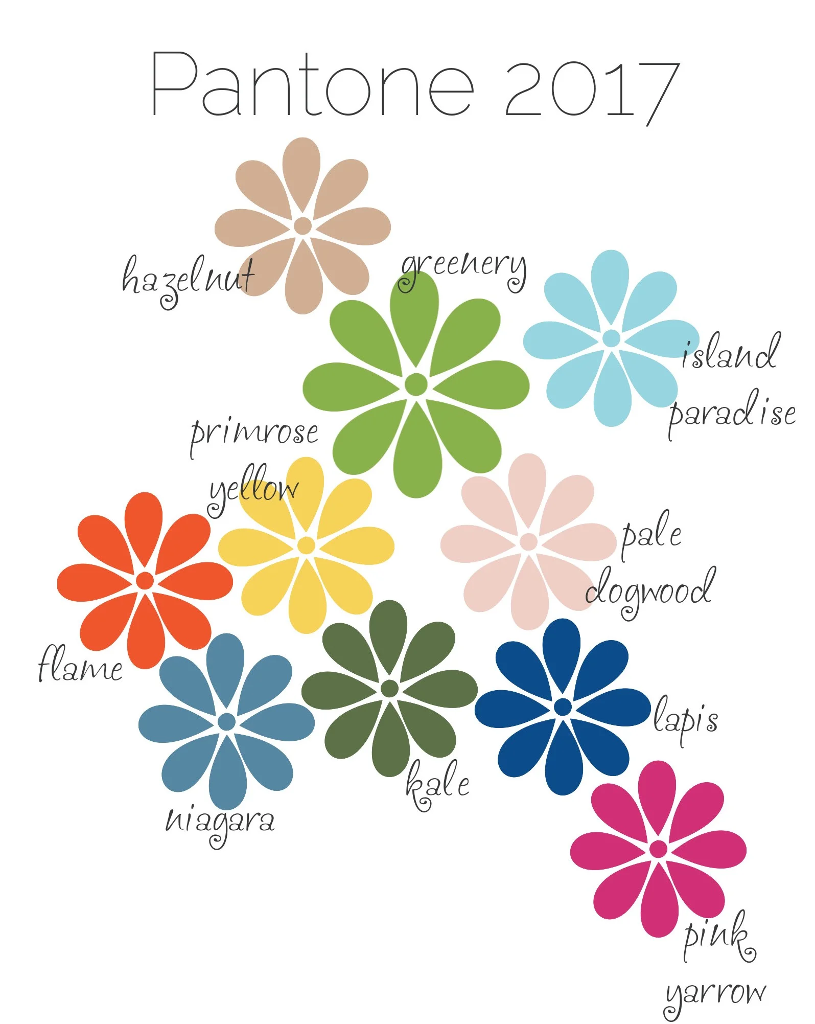
Pantone 2017 Colors

Here they are....the top colors for 2017. 

With a sense of earthiness and the great outdoors, these colors are both calming and vibrant. 

Greenery - The color of the year - Is about growth and reinventing ourselves.  It is both fresh and simple. 

Hazelnut - This shade is neutral and warm.  It is at home in all seasons. 

Island Paradise -  A calming blue that brings to mind beaches and vacations. 

Primrose Yellow - Such a happy color that reminds us of sunlight and buttercups. 

Pale Dogwood - This soft shade is romantic, light and airy. 

Flame - This warm shade is vibrant and energizing.  

Niagara - This shade of blue is comfortable and welcoming.

Kale - Such an earthy, natural color that brings to mind foliage and the outdoors

Lapis - This blue is bold and versatile.  It can be formal or whimsical. 

Pink Yarrow - With vibrant attraction, this color is uplifting and festive. 

colorsElaine Roberts
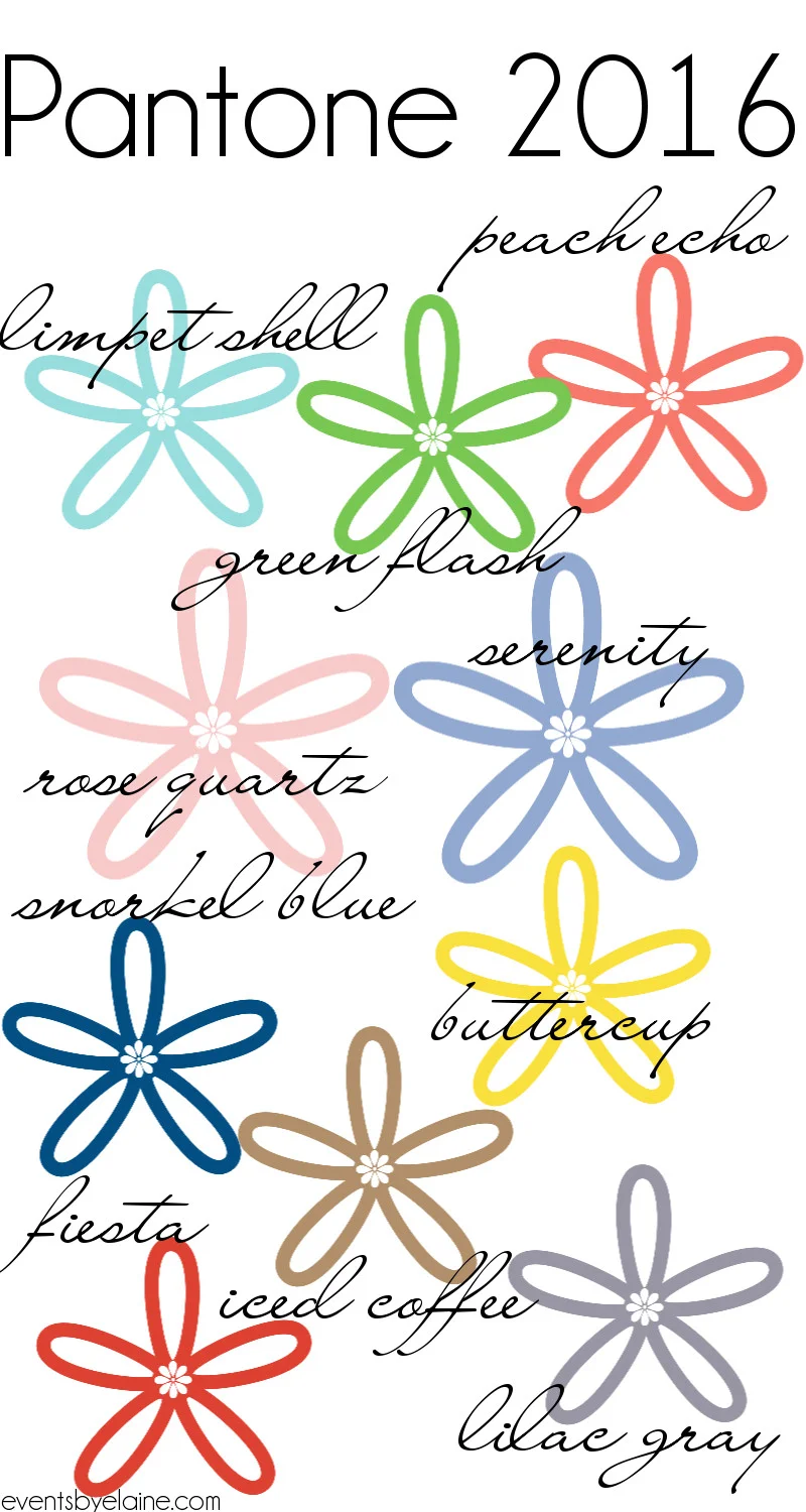
Pantone 2016 Colors

The top ten Pantone colors for 2016 have been chosen.  For this year for the first time, there is also, not one, but two colors of the year - Rose Quartz and Serenity. 

Here are the top ten colors:

1. Peach Echo - a warm and fun color with orange undertones

2. Limpet Shell - a crisp, cool blue reminiscent of the ocean

3. Green Flash - fresh and springy like newly cut grass

4. Rose Quartz - Color of the Year - The soft and gentle color evokes a spring blossom and romance. 

5. Serenity - Color of the Year - As the name implies, this color makes us think of a natural inspired calm. 

6. Snorkel Blue - a bold, energetic color that provides a large pop of color. 

7. Buttercup - this color reminds me of a warm, summery day

8. Fiesta - a warm, fiery red that is a bold touch

9. Iced Coffee - an earthy, natural inspired neutral

10. Lilac Gray - a lovely gray with lilac undertones. 

colorsElaine Roberts
5 Fresh & Fun Color Palettes for 2015

Since Pantone released their top colors for 2015, I have been thinking of fun and fresh color combinations for weddings, parties and events.  Here are 5 palettes to consider for your upcoming wedding. 

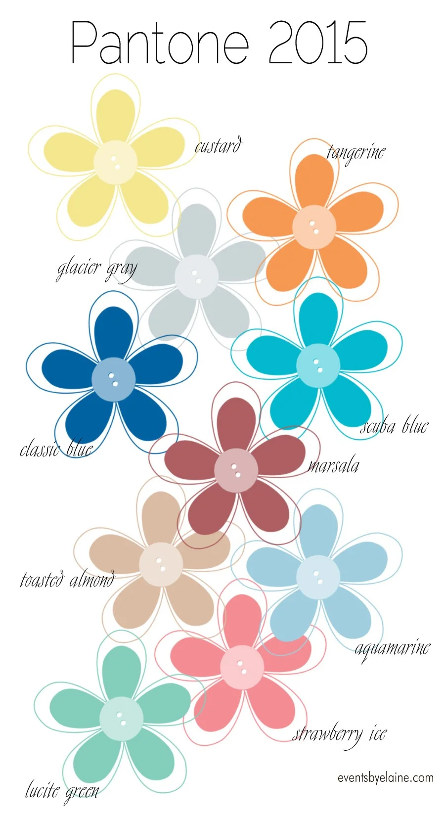
1. scuba blue, toasted almond, and lucite green -  The green and almond lend themselves to a natural wedding whilte the scuba blue adds a fun pop of color. 

2. aquamarine, glacier gray, and marsala - The light blue and gray provide a cool complement to the warm tones of the marsala red. 

3. strawberry ice, toasted almond, and tangerine - These fun and warm colors and perfect for a summer wedding or the bride who loves vivid colors

4. aquamarine, glacier gray, and classic blue - A palette of blues and gray creates a cool and fresh feel for any season.

5. custard, glacier gray, and lucite green - Lending itself to a range of styles from natural to vintage to whimsical, this combination is very versatile. 

colorsElaine Roberts
Pantone 2015 Colors

Pantone has once again released their top colors for the upcoming year, based on runway fashions, designers and sketches.  

Two things jump out to me immediately.  First, the overall color palette is muted and subtle with large hints of natural inspiration.  Second, blues and greens are taking center stage.   Some of these colors have been popular in previous years (hello again tangerine).

Here is the list:

Glacier Gray - This neutral color is a perfect partner to almost every other shade
Classic Blue - Timeless beauty is reflected through this vibrant color
Marsala - This color is warm without being bold while still keeping earthy roots
Custard - This mellow color remains subtle and relaxed while adding warmth
Lucite Green - This blue/green shade is both fresh and nostalgic
Tangerine - This bright color is sunny and brings a smile to your face
Strawberry Ice - This color is like a charming dessert that speaks of youth and renewal
Toasted Almond - Earthy and all natural, this neutral color provides balance
Scuba Blue - This eye catching color bring energy and excitement
Aquamarine - With a soothing feel, this color reminds of both the sky and the sea


colorsElaine Roberts
Pantone 2014 Spring Colors

Have you seen the colors for spring 2014?

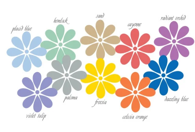
Dazzling Blue is the color for spring.  The collection includes a nice selection of both pastels and bolder shades.  They combine well together or with other pastels for that soft spring look.   Some of these colors have been influenced by the Royal family while others from Old World elegance with a few taken from nature.

I can already see these colors influencing spring and summer weddings. 

colorsElaine Roberts
Fall Wedding - Muted Pastel Colors

Most fall weddings use colors inspired by nature - red, orange, gold, and browns.  However, you can create a beautiful fall wedding using pastel colors.  The trick is to use soft, muddy, muted, faded colors instead of bright spring-like or "Easter egg" colors.

(Madie Flourney Photography)

(Madie Flourney Photography)

Using darker colors such as brown, gray and black will keep a fall feel, while softer colors make a fabulous contrast.

Pastel shades lend themselves to a softer vintage style wedding as well as natural elements.

Using darker vases and elements can keep centerpieces from feeling too light. 

The tangerine color of summer fades into a beautiful antique color of orange, gold, and copper. You can still use traditional fall motifs such as leaves and pumpkins. Choose them in more faded pastel colors or as dark accent pieces such as black pumpkins. 

colorsElaine Roberts